Low Color Contrast: What It Is and How to Fix It
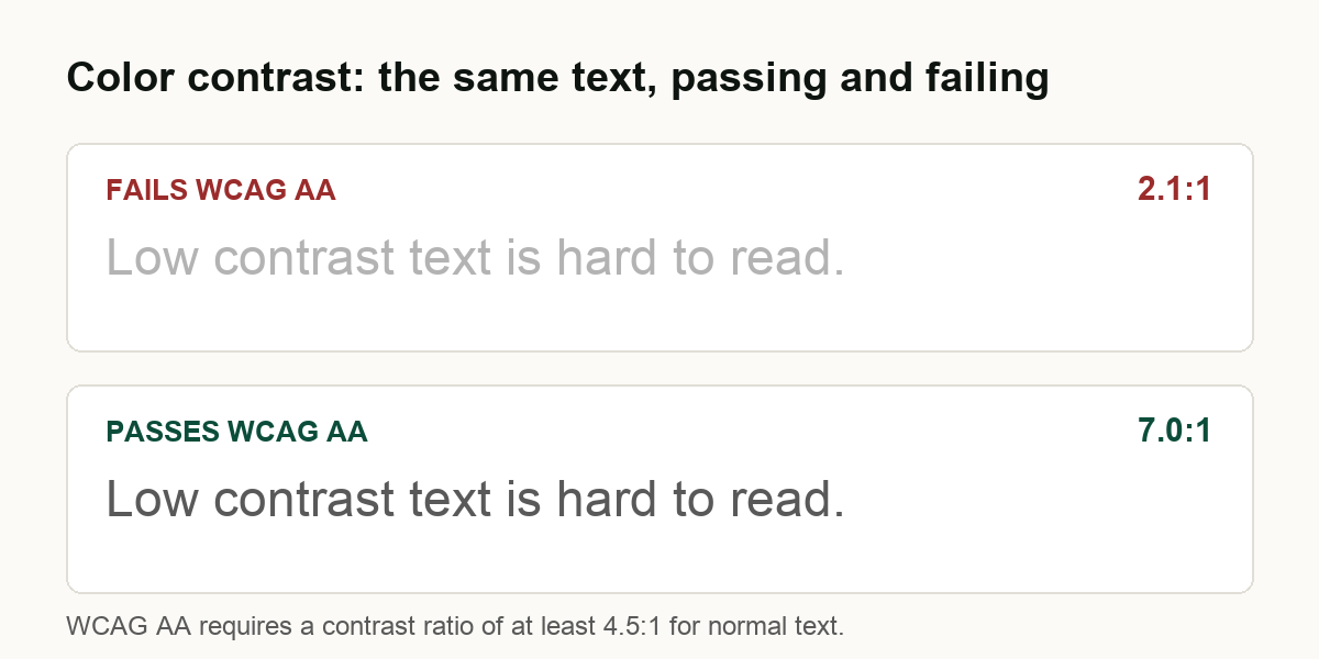
Low color contrast - text too light against its background to read comfortably - is the most common accessibility failure on the web. It was the single most frequent issue across the 299 large US home pages we scanned, on 88 of them, and WebAIM's scan of the top one million home pages puts low-contrast text even higher, on about 84%. WCAG 2.1 Level AA sets the bar at a 4.5:1 contrast ratio for normal text and 3:1 for large text. It is also the single most fixable accessibility problem, because an automated scanner catches most cases and the fix is usually a small color change.
Contrast is the easy one to dismiss. A pale gray caption or a trendy light-on-light button looks clean to a designer with a good monitor in a dark room. To a person with aging eyes, a vision impairment, or just a phone in bright sun, the same text can be invisible. This page covers what the contrast rule actually requires, who it shuts out, how common the problem is in real data, and how to find and fix it.
What color contrast means
Contrast ratio is a number that compares how light or dark text is against the color directly behind it. It runs from 1:1 (the same color, invisible) to 21:1 (pure black on pure white). WCAG sets a minimum so that text stays readable for people who do not have perfect vision.
The WCAG 2.1 thresholds at Level AA, the level US accessibility expectations generally point to, are:
| What | Minimum contrast ratio |
|---|---|
| Normal text | 4.5:1 |
| Large text (at least 18pt, or 14pt bold) | 3:1 |
| Icons, controls, and meaningful graphics | 3:1 |
The first two come from Success Criterion 1.4.3 Contrast (Minimum). "Large text" means at least 18 point, or 14 point bold - roughly 24 pixels, or 18.5 pixels bold. Bigger letterforms stay legible at a lower ratio, which is why they get the easier 3:1 bar. The third row comes from Success Criterion 1.4.11 Non-text Contrast, which extends the same idea to the parts of a page that are not text: a button's edge, a form field border, a focus outline, the bars of a chart. Pure decoration is exempt, but anything a user needs to see to operate the page is not.
Who low contrast shuts out
This is not a rule for a tiny edge case. Low contrast affects:
- People with low vision, who may have usable sight but need more separation between text and background to read.
- People with color vision deficiency, for whom certain color pairs collapse into the same muddy tone.
- Older readers. Contrast sensitivity declines with age, so a ratio that is fine at 25 can fail at 65 - and the over-65 group is a large, growing share of most audiences.
- Anyone in bad conditions. Glare on a phone screen outdoors, a dimmed laptop on battery, a cheap monitor: situational limits put everyone in a low-vision position sometimes.
The person who cannot read your pale gray text is not rare - they are a real share of the customers you already want.
How common is low contrast?
Very. In our State of Web Accessibility 2026 study, we scanned the home pages of 299 of the largest US organizations across eight sectors. Low color contrast was the single most common automated failure, flagged on 88 of them - more than any other issue, ahead of unnamed links and missing image alternatives. It showed up everywhere, but heaviest on nonprofit and law firm sites, where restrained gray-on-white palettes that read as "tasteful" routinely fall under the minimum.
WebAIM's 2026 analysis of the top one million home pages found low-contrast text on about 84% of them - the most common error in their data too, as it has been for years. Their figure is higher than ours because they count every instance across a page with a different engine, while we report whether a home page has at least one failure under axe-core; the methods are not directly comparable, but the conclusion is the same. Contrast is the defect the web fails most.
One honest caveat: a scanner catches most contrast problems but not all of them. It reads the colors declared in CSS, so it is reliable on solid backgrounds and reports the exact ratio. It cannot judge text laid over a photo, a video, or a gradient, where the background color changes pixel to pixel - those come back as "needs review" rather than pass or fail, and a person has to check them.
How to find it on your site
Three ways, from fastest to most thorough:
- Run a free scan. Our free check scans your home page and lists every color pair below the WCAG threshold, with the ratio, in about a minute. Any automated audit that uses axe-core will do the same.
- Check specific pairs by hand. Paste a foreground and background color into the WebAIM Contrast Checker and it returns the ratio and whether it passes. Useful for the "needs review" cases a scanner cannot compute, and for checking a color before you ship it.
- Inspect in the browser. The free axe DevTools extension runs the same engine interactively, so you can click a flagged element and see its ratio in context.
How to fix it
Contrast is satisfying to fix because the change is small and the result is measurable. The steps:
- Find the failing color pairs. Run a scan or use axe DevTools to list every combination below the threshold, with its ratio.
- Measure each against the requirement. 4.5:1 for normal text, 3:1 for large text, 3:1 for icons and controls.
- Darken or lighten until it passes. Usually the smallest fix is to darken a light gray body text, or deepen the brand color you use for links and buttons. A contrast checker tells you the moment you clear the bar.
- Do not rely on color alone. Where color carries meaning - a link inside a paragraph, a required-field marker, an error - add a second cue like an underline or an icon, so the meaning survives for someone who cannot tell the colors apart.
- Fix interface and graphic contrast too. Buttons, field borders, focus outlines, and meaningful icons need 3:1 against what sits next to them, under 1.4.11. Faint placeholder-gray borders are a frequent miss.
- Re-test, including states. Re-scan, then manually check hover, focus, and disabled states, plus any text over a photo or gradient. A button can pass at rest and fail on hover.
A note on tactics: do not reach for an accessibility "overlay" widget that promises to fix contrast automatically. They do not, and they create their own exposure - in 2025 the Federal Trade Commission fined the overlay vendor accessiBe one million dollars over claims that its tool could make any site conform to WCAG. We explain why overlays fail at this in detail. Contrast is fixed in your own CSS, once, and then it stays fixed.
What a contrast check can and cannot tell you
An automated contrast result is a strong signal, not a verdict. It reliably catches solid-background failures and gives you the exact ratio to fix. It cannot tell you whether text over an image is readable, whether a color pair is fine in light mode but fails in dark mode, or whether the design still communicates once you have stripped color as the only cue. Those need a person. And passing every contrast check is not the same as being "compliant" in a legal sense - contrast is one measurable property of a page, and whether a site meets a legal obligation is a question for an attorney. We measure conformance to WCAG and say exactly what we measured.
Common questions
What is the minimum color contrast ratio for WCAG? At Level AA, 4.5:1 for normal text and 3:1 for large text, plus 3:1 for interface components and meaningful graphics.
What counts as large text? At least 18 point, or 14 point bold - roughly 24px, or 18.5px bold. Large text gets the easier 3:1 bar.
Does low contrast fail WCAG AA? Yes - text below 4.5:1 (or 3:1 large) fails Success Criterion 1.4.3 at Level AA. A scanner catches most cases; text over images needs a human check.
How do I check my site? Run a free check for the whole home page, or paste individual color pairs into the WebAIM Contrast Checker.
Check your own site
The fastest way to know where you stand is to look. Run a free automated check on your home page and you will get every failing color pair with its exact ratio in about a minute. If you want the full picture across your whole site, see what a complete manual and automated audit covers, and how monitoring catches the contrast regressions that creep back in every time someone ships a new component. For the wider context behind the numbers on this page, read the State of Web Accessibility 2026.